

One of the biggest problems in mobile UI design is limited screen real estate. An effective technique for optimizing space involves using tabs that allow the user to flip from one set of controls to another while maintaining the context of the current page. Xamarin Forms provides the TabbedPage for this purpose.
The TabbedPage is the natural go-to when you want to implement multiple tabs in your application. It’s easy to implement a stand-alone page that provides navigation to other sub-pages without leaving the parent page. And, as Xamarin is quick to point out, the final look on various platforms is native to that platform: For iOS, icons, and text in a bar along the bottom. For Android, desktop-like tabs along the top.
However, issues can arise quickly as you try to integrate the TabbedPage into your project. If you are using a navigation page and opening content pages within it, there are issues you have to contend with related to having a navigation sub-page to itself be a container for sub-pages.
There’s also the native-look situation. Although the automatic adoption of the native platform paradigm for tabs is a neat trick, it isn’t always what you want. If you have specific ideas about the interface you are creating and how it should look and act, you may be frustrated at the lack of customization and the completely different look on the two platforms. Although it’s true that a different, native look for each platform is sometimes preferable, often it’s not. If you are developing business applications for the mobile platform, you might find that having a similar user interface across all platforms is the best way to go. Your marketing department may be eager to assure that the branding and other UI elements are always the same. And it certainly simplifies support/help-desk troubleshooting.
Options?
After reviewing the components available on the Xamarin site and elsewhere, I didn’t find any good options for a tab solution that worked on both Android and iOS. Likewise, no luck reviewing forum posts for alternatives. So, I did what any good developer would do: I built it myself!
Benefits
The solution I provide in this article is called BetterTabControls. It has a number of benefits:
- It’s self-contained, so it can be easily referenced and used from any project.
- It’s implemented as a set of standard controls on a page, not a specific type of parent/sub-page arrangement.
- The user interface for each tab is collected in one place so you don’t have to hop among different files to see what the page will look like.
- It provides a set of controls that do all the work for you. Just drop them in, define their look, and populate the tabs.
- The controls themselves inherit from standard controls and provide all the properties and methods of their underlying type. This gives you the ultimate in flexibility in layout and style.
- The controls can be instantiated in code or used through standard XAML syntax.
- There are no platform-specific renderers (more on this later).
Using BetterTabControls
I’ll first show you how to use BetterTabControls. Then, if you like, you can take the code and use it in your own application without reading further. However, for those interested, I’ll go on after this section to show how the controls were built and how they work.
The first step is to add a reference in your application to the BetterTabControls project. (The PCL also can be compiled and the DLL referenced, if you prefer.)
Then, add the controls to your page. In this example, I’ll assume you’re using XAML. Instantiating in code works very much the same. This simple page puts BetterTabControls to work.
<?xml version="1.0" encoding="utf-8" ?>
<ContentPage
      xmlns_x="http://schemas.microsoft.com/winfx/2009/xaml"
      xmlns_TabCtrls="clr-namespace:BetterTabControls;
         assembly=BetterTabControls"
      x_Class="App2.Page2"

      BackgroundColor="White"
      Title="  Time Sheet">


   <StackLayout Orientation="Vertical"
                VerticalOptions="FillAndExpand"
                HorizontalOptions="FillAndExpand">

      <Label
         Text="Select the appropriate tab to view by project,
            week or day."
         TextColor="Black" VerticalOptions="Center"
         HorizontalOptions="Center" />

      <TabCtrls:BetterTabs x_Name="ProjectsDaysTabs"
               Orientation="Vertical"
            SelectedTabIndex="1"
            SelectedColor="Lime" UnselectedColor="Green"
            VerticalOptions="FillAndExpand"
            HorizontalOptions="FillAndExpand">

         <TabCtrls:BetterTabButtons Orientation="Horizontal">
            <TabCtrls:BetterTabButton x_Name="ProjectsTabButton"
               Text="Projects"
               BorderRadius = "1" BorderWidth = "2" HeightRequest="35"
               WidthRequest = "75" FontSize="13" TextColor="Black"/>
            <TabCtrls:BetterTabButton x_Name="WeeksTabButton" Text="Weeks"
               BorderRadius = "1" BorderWidth = "2" HeightRequest="35"
               WidthRequest = "75" FontSize="13" TextColor="Black"/>
            <TabCtrls:BetterTabButton x_Name="DaysTabButton" Text="Days"
               BorderRadius = "1" BorderWidth = "2" HeightRequest="35"
               WidthRequest = "75" FontSize="13" TextColor="Black"/>
         </TabCtrls:BetterTabButtons>

         <TabCtrls:BetterTab x_Name="ProjectsTab" IsVisible="True"
               VerticalOptions="FillAndExpand"
               HorizontalOptions="FillAndExpand"
               BackgroundColor="Pink">

            <Label Text="Projects Tab" HorizontalOptions="Center"
                  TextColor="Black" />

         </TabCtrls:BetterTab>

         <TabCtrls:BetterTab x_Name="WeeksTab" IsVisible="False"
               VerticalOptions="FillAndExpand"
               HorizontalOptions="FillAndExpand"
               BackgroundColor="Yellow">

            <Label Text="Weeks Tab" HorizontalOptions="Center"
                  TextColor="Black"/>

         </TabCtrls:BetterTab>

         <TabCtrls:BetterTab x_Name="DaysTab" IsVisible="False"
               VerticalOptions="FillAndExpand"
               HorizontalOptions="FillAndExpand"
               BackgroundColor="Aqua">

            <Label Text="Days Tab" HorizontalOptions="Center"
                  TextColor="Black"/>

         </TabCtrls:BetterTab>

      </TabCtrls:BetterTabs>
   </StackLayout>
</ContentPage>
When this page is displayed, it looks like what’s shown in Figure 1.
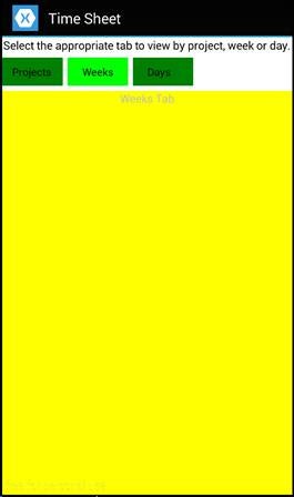
Figure 1: The Time Sheet’s tabs
When you click the Projects tab button, you see the contents of Figure 2.
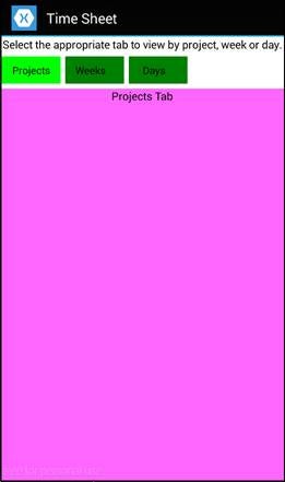
Figure 2: The Time Sheet’s Projects tab
Earlier, I touted the freedom to customize the look/feel of this approach. Please don’t take this application as an example of the styling possibilities. The artistic prowess demonstrated is clearly underwhelming!
Organization
Notice the organization of the controls within the page.
<TabCtrls:BetterTabs>
   <TabCtrls:BetterTabButtons>
      <TabCtrls:BetterTabButton>
      <TabCtrls:BetterTabButton>
      <TabCtrls:BetterTabButton>
   <TabCtrls:BetterTab>
   <TabCtrls:BetterTab>
   <TabCtrls:BetterTab>
All the tab-related controls are in the parent <TabCtrls:BetterTabs>. Within that is a collection of buttons called <TabCtrls:BetterTabButtons>. The buttons are of type <TabCtrls:BetterTabButton>. (The singular/plural distinction is important!) Finally, the <TabCtrls:BetterTab> elements, which contain the contents of each tab, are also within the parent (but not grouped into their own parent as with the buttons).
There’s only one important thing to know: The button elements and the tab elements are each an ordered list and the first button is associated with the first tab, the second with the second, and so on. Obviously, there must be the same number of buttons as tabs.
Tab Control Properties Available
Each tab control simply extends an existing Xamarin Forms control, adding its own properties and code. Here are the base classes for each:
| Control | Parent Control |
| BetterTabs | StackLayout |
| BetterTabButtons | StackLayout |
| BetterTabButton | Button |
| BetterTab | StackLayout |
This means that any properties you’d set on a StackLayout—such as orientation, horizontal/vertical options, background color, visibility, and so forth—are available with BetterTabs, BetterTabButtons, and BetterTab. Likewise with BetterTabButton for Button properties.
In addition to the standard properties, there are a couple added to BetterTabs so you can specify tab-related information.
- SelectedTabIndex: An integer value between 0 and the highest numbered tab (in this example, the tabs are numbered 0, 1, and 2). This determines which tab will be selected when the page is first displayed.
- SelectedColor and UnselectedColor: The color applied to the background of the selected tab button and those that aren’t selected.
That’s all you need to know! You can organize your controls as you like anywhere within the page. You can even put the tab buttons below the tab contents.
Coding the Controls
Now, I’ll go into the code behind the controls. It isn’t rocket science, but I think it’s a useful tool and a good example of the ease of inheriting and extending existing controls and then coordinating them to work together.
Custom Controls without Custom Renderers
Xamarin Forms’ controls, in general, are lacking in variety and richness. It’s a lowest-common-denominator solution—providing only features that are fully supported on all platforms. The controls and features will grow in time, but today the answer to the limitations is always the same: custom controls and usually custom renderers.
The trouble is that, to create a custom renderer, you have to have a strong understanding of all the native platform UI paradigms. And, if you haven’t discovered it for yourself already, each platform’s UI requires its own significant learning curve.
But, there are times when you can create custom controls without resorting to custom renderers. You can inherit from existing Xamarin Forms controls and then extend them with your own properties, methods, and event code. This is the approach I’ve taken here to implement BetterTabControls.
BetterTabButton: Click to Change Tabs
There are four controls, but two of them are not extended in any way: BetterTabButtons, which is just a container for the set of tab buttons, and BetterTab, which is simply a container for all the UI elements the user wants on a given tab.
The first extended control is BetterTabButton. Its code is shown in the following samplee.
using System;
   using Xamarin.Forms;

namespace BetterTabControls
{
   public class BetterTabButtons : StackLayout {}

   public class BetterTabButton : Button
   {

      public BetterTabButton()
      {
         Clicked += ThisTabButtonClicked;
      }

      public void ThisTabButtonClicked(object s, EventArgs e)
      {
         BetterTabs prnt = validParentBetterTabs();
         if (prnt == null) return;

         prnt.SelectedTabButton = this;
      }

      private BetterTabs validParentBetterTabs()
      {
         // Work your way up to the grandparent; parent should be
         // BetterTabButtons and grandparent should be BetterTabs
         if (Parent != null && Parent.Parent != null &&
            Parent.Parent.GetType() == typeof (BetterTabs))
            return ((BetterTabs) Parent.Parent);
         else
         {
            throw new Exception(
               "Grandparent of a BetterTabButton " +
               "must be a BetterTabs");
         }
      }
   }
}
When the user clicks a tab button, the parent of the parent is checked—it should be a BetterTabs. If not, an exception is thrown. Otherwise, the SelectedButton property is set to this button. This has the effect of changing the look of the buttons and setting the associated tab to being visible, as you’ll see in BetterTabs.
BetterTabs: Where It All Happens
BetterTabs acts as the coordinator and implementer of the intelligence here.
using System;
using System.Collections.Generic;
using System.Linq;
using Xamarin.Forms;

namespace BetterTabControls
{
   public class BetterTab : StackLayout { }

   public class BetterTabs : StackLayout
   {
      private Color _selectedColor = Color.White;

      public Color SelectedColor {
         get { return _selectedColor; }
         set { _selectedColor = value; }
      }

      private Color _unselectedColor = Color.Silver;

      public Color UnselectedColor {
         get { return _unselectedColor; }
         set { _unselectedColor = value;
      }
The trivial BetterTab is declared first. BetterTabs first declares the SelectedColor and UnselectedColor, providing defaults of white and sliver.
Next are the TabButtons and Tabs properties.
            internal List<BetterTabButton> TabButtons
            {
               get
               {
                  BetterTabButtons tabButtons =
                     (BetterTabButtons)Children.
                     First(c => c.GetType() ==
                        typeof (BetterTabButtons));
                  var buttonEnumerable =
                     tabButtons.Children.Select(c =>
                        (BetterTabButton) c);
                  var buttonList =
                     buttonEnumerable.Where(c => c.GetType() ==
                        typeof (BetterTabButton)).ToList();
                  return buttonList;
               }
            }

             internal List<BetterTab> Tabs
             {
                get
                {
                   var childList =
                      Children.Where(c => c.GetType() ==
                         typeof(BetterTab));
                   var tabList =
                      childList.Select(c => (BetterTab) c).ToList();
                   return tabList;
                }
            }
These properties are intended for use only within the control library, so their access is internal. They are also read-only, so only get is implemented. They provide references to the tab buttons and tabs, but no separate list is maintained as a private backing variable. Instead, LINQ queries are performed on the children and grandchildren, selecting the appropriately typed elements and converting the result to a List. This will simplify accessing this information wherever it’s needed.
The selected methods are next.
            private int _selectedTabIndex;
            public int SelectedTabIndex
            {
               get { return _selectedTabIndex; }
               set
               {
                  _selectedTabIndex = value;

                  if(Tabs.Count > 0)
                     SelectionUIUpdate();
               }
            }

            public BetterTabButton SelectedTabButton {
               get { return TabButtons[_selectedTabIndex]; }
               set
               {
                  var tabIndex = TabButtons.FindIndex(t =>
                     t == value);
                  if (tabIndex == -1)
                     throw new Exception(
                        "SelectedTabButton assigned a button " +
                        "that isn't among the children  of "+
                        "BetterTabButtons.");

                  if(tabIndex != _selectedTabIndex)
                     SelectedTabIndex = tabIndex;
               }
            }

            public BetterTab SelectedTab
            {
               get { return Tabs[_selectedTabIndex]; }
            }
The selected tab is always identified by its index number in _selectedTabIndex. It may be set/accessed via the SelectedTabIndex property, as was done in the preceding XAML to specify the initially-selected tab. In addition, the user interface is updated, when appropriate. Why do I check Tabs.Count()? Because this property setter is triggered while the page is being rendered—and before the child objects are instantiated. I’ll handle updating the interface for that situation in a moment, in the OnParentSet() method.
When a tab button is clicked, it doesn’t know what index is assigned to it from the parent. It could calculate that, but it’d make more sense to do that here in the parent. That’s why the SelectedTabButton property was created. When it’s assigned, the setter obtains the index of the assigned button and sets the SelectedTabIndex.
Finally, it is sometimes helpful to obtain the selected tab—the one holding the UI that’s currently displayed on the page. Although this is easy to get, a property is provided to make it a bit easier.
Next, I needed to do a few things after all the tab controls are instantiated. And, fortunately, there’s a convenient function override available for that.
            protected override void OnParentSet()
            {
               base.OnParentSet();

               if (tabButtons.Count != tabs.Count)
               {
                  throw new Exception(
                     "The number of tab buttons and the " +
                     "number of tabs to not match.");
               }

               SelectionUIUpdate();
            }
As the name implies, this function occurs when (actually, after) the Parent property is set for this control. If you check to see how many children there are for BetterTabs in the BetterTabs constructor, it’ll tell you zero. However, when OnParentSet() is triggered, all the children are instantiated and available.
The first thing I do here is verify that the number of tab buttons and the number of tabs match.
Then, I call the SelectionUIUpdate() function, which is the last one in BetterTabs.cs.
            private void SelectionUIUpdate()
            {
               foreach (var btn in TabButtons)
                  btn.BackgroundColor = UnselectedColor;
               SelectedTabButton.BackgroundColor =
                  SelectedColor;


            foreach (var tb in Tabs)
               tb.IsVisible = false;
            SelectedTab.IsVisible = true;
         }
   }
}
The intent here is to update the UI based on the selected tab. All the tab buttons’ colors are set to the “unselected” color. Then, the selected tab button color is set to the “selected” color. Finally, all the tabs are made invisible and the SelectedTab is made visible.
Conclusion
I hope these controls are useful to you. And, I hope the code has provided a little insight into creating custom Xamarin Forms controls (without custom renderers) and how to get them working together.